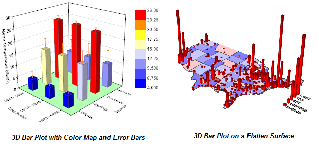
Data journalism is becoming a staple of modern media, which is a good thing - data mapping is a great way to tell a story.
Take the mapped graph to the right, for example. It presents export-based wealth creation in Toronto, but it could just as easily show federal spending.
Imagine a map of the country that featured every riding colour-coded to the party of their MP, and then layered on top of that bars of federal funding by program in one colour and next to that, relevant outcome indicators in another.
For example, let's say some regions haven't voted in a Conservative once during Harper's tenure.
How much funding have they received for transit infrastructure? How has that funding (or lack of funding) impacted other factors, like job creation?
Especially given that the Harper Government's new "Canada 150" community infrastructure grant is setting dramatically different rules for different parts of the country, it'd be interesting (and timely) to see a visualization of what pork barrel politics is doing to our country.


No comments:
Post a Comment